Project completed at Keane.
A stunning social space, serving up small plates, sharing dishes, and delicious drinks every day, early until late.

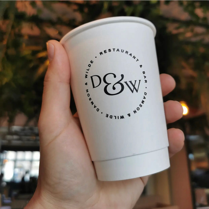
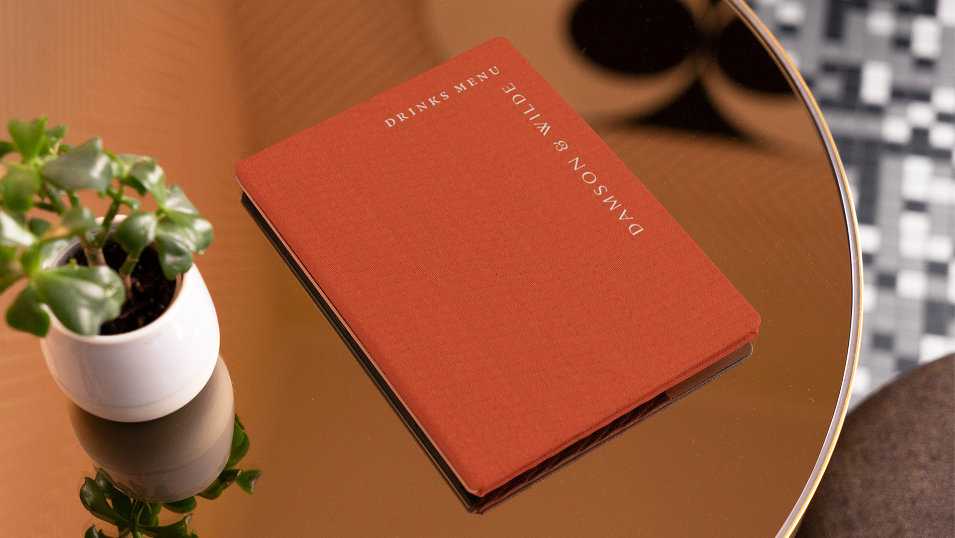
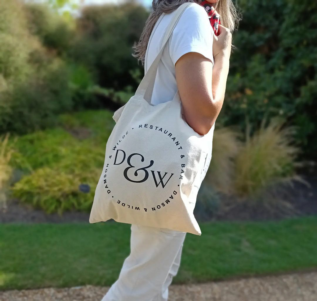
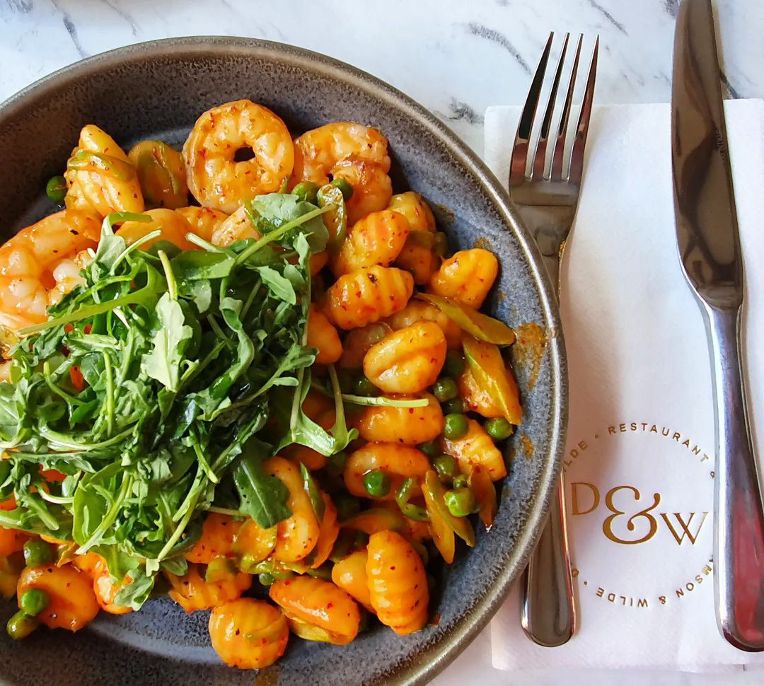
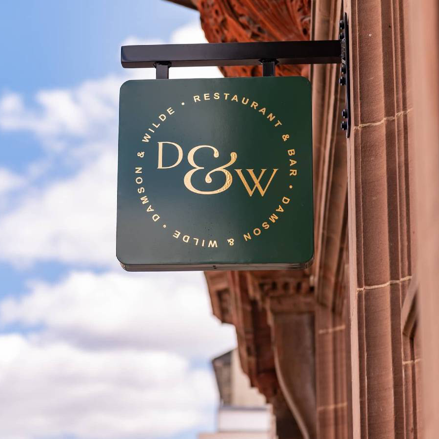
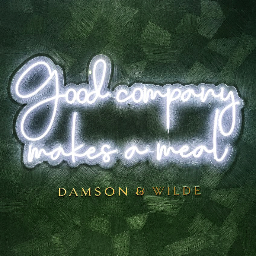
Channeling a stripped-back sophistication, the Damson & Wilde logotype comes to life in a gold foil. It is balanced by its friendly and more casual roundel form.
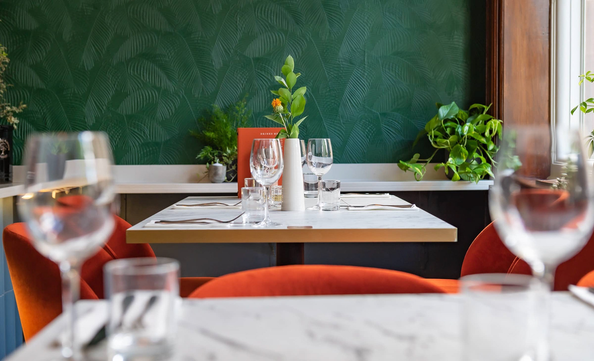
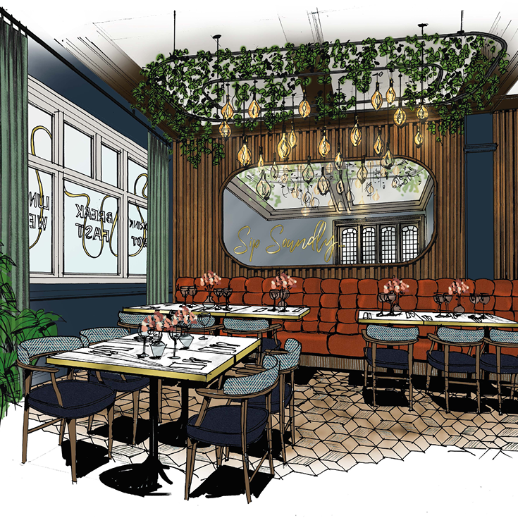
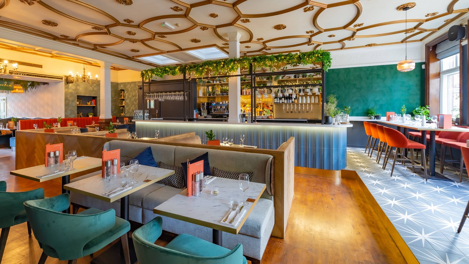
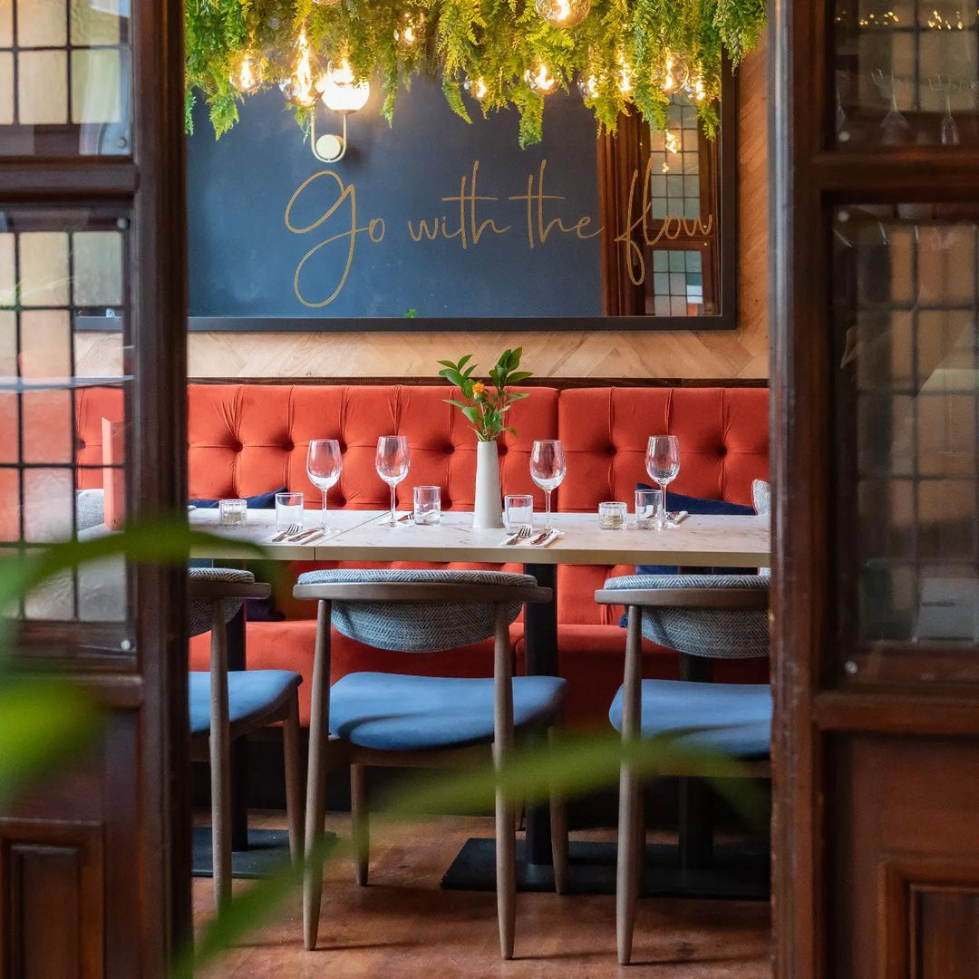
Working alongside the interior design team, I aimed to deliver a cohesive identity that blended seamlessly from the core brand look and feel into the physical space.
The friendly hand-script font used on the Damson & Wilde menus and comms threads through the interior space on mirror vinyls, wayfinding, and neon signage.